Tagged: t-shirts

T-Shirt Therapy for the Spring Semester

The end of the semester is a challenging and stressful time for both students, teachers, and administrators alike. It can be a very creative and productive time for most, but sometimes, it can be a frustrating as there might not be any immediate result to all that work.

Screen printing t-shirts can be a therapeutic, creative outlet where I get to work with my hands and make something tangible. Here are some shirts I’ve printed at the end of spring semester in anticipation of summer!

Kilo Bravo

With summer coming, I convinced the proprietress of Kilo Bravo that she should stock some t-shirts for their thirsty and overheated customers. The t-shirts are Gildan Soft Style, which is a blend of 65% polyester and 35% ring-spun cotton. She chose shirts in Heather Military Green, for the military theme that “Kilo Bravo” evokes (although it also stands in for her initials).

Kilo Bravo Military Summer 2016

The print is a single-color, white discharge ink that I thought would not be very bold because of the polyester fabric, but I was wrong. They really pop! In retrospect, I would have used clear discharge in hopes of getting the natural fabric color that would evoke the military color even more. Print and learn.

On sale at Kilo Bravo, 180 N. 10th St, Brooklyn, NY

Balls Deep

Easily one of the most “adult” logos I’ve ever printed, Balls Deep is a softball team founded by one of my oldest softball friends. As you can imagine, the logo has raised some eyebrows over the years, and some players have gone as far as quit the team rather than wear the shirt.

Balls Deep Softball 2016

This particular shirt is printed on American Apparel’s Fine Jersey all-cotton t-shirt in red. This t-shirt model is such a stalwart of the industry that you most certainly have one in your closet, if not wearing one at the moment. The print is nothing more than Holden’s water-based black ink.
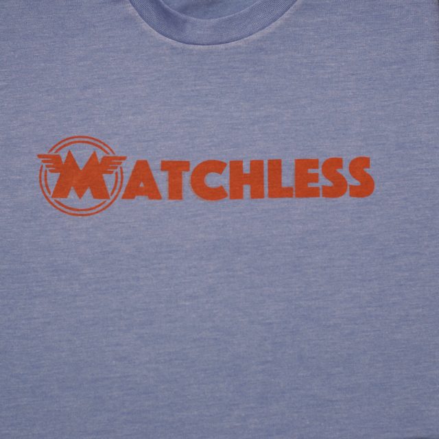
Team Matchless

The manager of this softball team, sponsored by Bar Matchless in Brooklyn, has a favorite t-shirt. Printed for the Oregon Humane Society, she wanted to use that t-shirt for her team because it is so comfortable. She showed it to me, and I saw that it was an American Apparel Tri-Blend t-shirt in Tri-Athletic Blue. Wanting to do something different that the usual white print, she had me print the front logo and the back jersey numbers in water-based orange ink.

I even printed a couple for myself on Tultex poly-cotton shirts in a similar color.

Matchless 2016

The Tultex shirts look fine, but as I examine the shirt, I notice that the weave looks a little pixelated.

Tultex – "pixelated" weave

Nonetheless, for what both shirts lack in “pop,” they both make up in lightweight and soft-feel. It’s perfect for summer softball.

Robots

Having surrendered managing the Robots years ago, the current manager wanted to get jerseys made, instead of my usual t-shirt offerings. The jerseys haven’t materialized yet, but I made a t-shirt version of what I think he made for our team.

Gibson (Angry) Robots 2016

The t-shirt is nothing special, just a Gildan Soft Style 100% ring-spun cotton in black. But the print is discharge ink with red pigment.

Were I to do a full run, I would print on American Apparel’s sheer jersey “Summer Shirt” in black. That is, by far, the most comfortable all-cotton shirt I’ve ever worn. However, because they cost three times as much as this Gildan—and because they only ship from the Los Angeles–area mill, I would only offer it as a premium product for a sizable run.

Archived Bears

The Archive used to be a coffee shop and video store in the 2000s. Located off the Morgan Avenue L-train station and used to be considered a “far, far away,” the Archive also used to sponsor a softball team in our league: the Bears.

The Bears are still around, even if the Archive is long gone, and they wanted to print a new version of their shirt.

Archived Bears Softball 2016

This shirt is another Gildan Soft Style t-shirt in dark chocolate. The print is a water-based opaque yellow color that has a soft hand without the extra chemical process of discharge.

Librarians

On a whim, I printed a couple of copies of the stalwart Librarians t-shirt. Unlike our usual shirt, I printed the shirts on an off-white shirt in black ink.

Librarians Reprint 2016

I’ll debut the shirt at our season opening double-header and, perhaps, maybe even take a few orders for a lighter alternative to our current black t-shirts.

Cervantes and Shakespeare T-Shirt

Four hundred years ago this month, Miguel de Cervantes Cortinas and William Shakespeare died. It is almost cosmic that the most celebrated Renaissance writer of Spain and the most celebrated Renaissance writer of England both died on same day: April 23, 1616.

If it seems unlikely that Cervantes and Shakespeare died on the very same day, it is because they did not die on the same day. Cervantes died a day earlier, on April 22, 1616. And because England was still using the Julian calendar in 1616, Shakespeare died 11 days later on May 3, 1616. However, you cannot deny that it makes for a better story if the two did die on the very same day. In fact, the United Nations has—since 1995—observed a World Book and Copyright Day on April 23 to remember the passing of Cervantes and of Shakespeare, as well as that of other writers including Garcilaso de la Vega and Vladimir Nabokov.

To commemorate the quadcentennial, I printed a run of t-shirts.

Shakes-and-Cervantes-discharge

The all-black t-shirts are made from 100% high-quality, ring spun cotton that makes for very soft and comfortable shirt. The artwork is discharged. Unlike most every t-shirt printed today, there is no layer of plastic ink nor is the fabric dyed. Instead, I removed (“discharged”) the black color from the t-shirt, leaving behind the natural color of the all-cotton fabric. On the black t-shirt, the artwork looks sepia-toned. It’s very cool.

The result is the most comfortable t-shirt you’ve worn and because the artwork is not dyed, it will never fade. It might even last until the quincentennial, although the t-shirt might not last that long.

If you’re interested in getting a shirt, order one at my popup online store.

Update: Sales of this shirt are available. Minimum order of two (2) shirts. Allow three-to-five business days.

Buy this t-shirt!

Going Green: Greenpoint to Greenport in July

Over the last couple of months, a few of cycling buddies and I have been entertaining the idea of riding along the north shore of Long Island to the North Fork town of Greenport. Like Montauk, Greenport is a worthwhile cycling destination because both towns are about 100 miles from New York City and are each the terminals of the easternmost Long Island Railroad lines.

This past Saturday, four of us rode the Ride Between the Greens, a 108-mile ride from Greenpoint, Brooklyn to Greenport, Long Island. Incidentally, we also rode a few miles south of of Greenvale and through Greenlawn.

Between the Greens, July 25, 2015

The ride takes advantage of the fact that the two locations are on opposite ends of Long Island and that they are similarly named. Green also provides a nice theme when it comes to designing a t-shirt.

Between-the-Greens.png

Regular readers of this site will remember that I am not new to riding along the North Fork. I went on rides in September, October, and November last year. However, each of those rides started in Suffolk County, either at Huntington or at Babylon, where I caught an LIRR train to save about forty miles of pedaling.

This ride, like my now-annual ritual of riding to Montauk, started in Greenpoint, at Transmitter Park. There, a sign signals the end of the road that ironically was the beginning of our ride.

Ride with Between the Greens

The route followed some pretty major arterial roads that were lightly trafficked early on Saturday morning. We took Greenpoint Avenue, over the Newtown Creek, to Queens Boulevard and then east to Douglaston to ride the LIE Service Road for a 14-mile stretch to Syosset. In Syosset, we stopped for our first meal of the day at—where else—a Panera Bread location.

Ride with Between the Greens

After filling up on egg sandwiches and coffee, we headed towards Cold Spring Harbor and then to Huntington, where two of last year’s North Fork rides started. As a sign that we were riding on well-worn cycling routes, we spotted markings for several other rides, including the Huntington Bicycle Club’s Gold Coast Tour, the Suffolk Bicycle Riders Association’s Bike Boat Bike ride, and, yes, faded marks from past North Fork Century rides.

Speaking of well-worn places, we stopped at Briermere Farms for a peach-raspberry pie. The pie wasn’t to our expectations, which was a little disappointing considering that peaches and raspberries used in the filling were both in-season and especially surprising given that we were famished from this ride.

Ride Between the Greens

The ride was especially tough. As happened almost on every Long Island–ride last year, we faced a stiff headwind most of the day, and as we got closer to the end, the wind intensified. Four of us started the ride, but only three of us finished: one guy bailed about 70 miles into the route. Another rider was riding her first century ride and was challenged by the sheer length of the ride. But regardless of our experience and our training, we all were physically and mentally drained on this ride.

Ten hours and almost 110 miles after starting in Greenpoint, we arrived in Greenport just after 4:30 PM. As soon as we arrived, we went to the Greenport Harbor Brewing’s taproom to fill our growler—yes, I carried a 64-ounce glass bottle for over one-hundred miles—for the train ride home. We then went to the Little Creek Oyster Farm and Market for a bucket of two-dozen oysters we shucked ourselves.

Ride Between the Greens

We caught the 6:11 train out of Greenport—the last train that runs on weekends—back to New York City. Credit goes to my Tom Bihn Daylight backpack because, despite its apparently small size, it carried a full growler of beer, a pie, and my wallet, keys, phone, snacks, and the mirrorless camera I used to snap some photos that day.

Ride Between the Greens

As we nibbled on our pie and sipped our beers, I asked, “so, when are we riding the South Fork?” The silent but stern glances I got in response suggested that it was a little too soon to consider a ride to Montauk.

One of the coolest parts of the ride was, when in Greenport, Ian Wile, the proprietor of the farm and market heard about our ride and came to personally congratulate us. He confessed that he always wanted to do a ride like this. I was tempted to quip that I always wanted to run an oyster farm and market, but honestly, I would even know where to start.

Maybe I should send him a t-shirt.

Going French

Wow, and just like that, it’s Bastille Day again.

A lot has happened in the last year, and in trying to not reflect on the many changes in my life, I decided to simply make a t-shirt for the occasion.

Birthday Bastille Day T-Shirt

The t-shirt saw some time out in the wild on Sunday, when I decided to observe the day on a weekend afternoon.

And, yes, I’ll be wearing it again later today.

Bastille Day only comes once a year, and I can’t bike to Philadelphia to catch a storm of Tastykakes at a completely historically accurate reenactment of the storming of the Bastille every year.

Let them Eat Tasty Kakes

But as easy as it is to get all self-absorbed today, it was great to remember our place in the universe because we have the best look at Pluto ever!

New Horizons Flyby of Pluto

Soft Spot Turns 10, and I Printed the T-Shirts

On July 15, a day after Bastille Day, the Soft Spot at 128 Bedford Avenue in Williamsburg, Brooklyn, is hosting its tenth anniversary party. I went three years ago to their seventh anniversary, where they played up the 7 theme by turning the joint into a fake casino.

IMG_1360

For this year’s festivities, I was commissioned to print five dozen t-shirts based on this design.

Softspot ashgrey noaddress

Printing these particular shirts involved every aspect of what I have come to appreciate as an easy job.

  1. The shirts were mostly-cotton, heather grey shirts from American Apparel. It is much easier to print on light-colored shirts compared to dark ones because I can avoid…
    • using water-based opaque ink that dries in the screen and can extend production time
    • using discharge ink, which smells like rotting fish and is probably a little toxic
      It is also easier to print on all-cotton or 90% cotton because they ink adheres better to the fabric.
  2. The design involved only one color. It saved me from having to burn two screens, and I didn’t have to resort to any two-color trickery with my one-color printing station.

  3. It was easy to custom mix the ink. My ink supplier doesn’t make burgundy so I resorted to mixing a little bit of brown ink into vicon red which more or less made burgundy ink.

    IMG 4192

  4. I printed the entire run inside my studio space. Because of the noxious fumes involved with discharge printing, I often have to print on the front porch. As nice as that might sound, it presents some logistical challenges: it requires sunlight, which is hard to exploit with my work schedule, and it leaves me exposed to blood-thirsty mosquitoes. Here, I could print indoors with artificial light and some light air conditioning.

Once I had the ink mixed, I was able to load each shirt on to my printing station and churn out one shirt after another.

IMG 4194

As is common in the summer, the shirts air dry very quickly. By morning, they were completely dry, ready for heat treating, packaging, and delivery.

IMG 4199

Speaking of delivery, aside from sourcing the t-shirts from American Apparel in Los Angeles, everything used to make these shirts was sourced within Brooklyn and Manhattan. It seems fitting that I will be taking these shirts to the bar on foot.

Soft Spot 10th Anniversary

  • July 15, 2015
  • 128 Bedford Ave, Brooklyn

Librarians Shirts: Back in White

Librarians_White_2011

Although it’s a little late in the season, a vocal contingency of our players asked me on Friday about getting new shirts. Since I kept the screen from last year’s t-shirt run, I can print the shirts without too much trouble. The only challenging part is actually buying the shirts and/or getting them delivered in time for our double-header later this week.

The major difference between this year’s shirt and the one from 2010 is that I’m printing white shirts with the design in black ink. We did that for the tank tops that were for sale at the Library Bar, and I thought they looked better than the ones we made for the team. Evidently the design works better when it’s printed with a dark-colored ink on a light-colored medium, such as a white shirt.

As soon as I get the shirts, I’ll post pictures of the printing process and of the finished product.